I wrote the complete RaceArt brand book to establish a streetwear company rooted in street racing culture. The work required translating an authentic cultural connection into a system that could guide all brand decisions while maintaining credibility with people who actually know the scene.
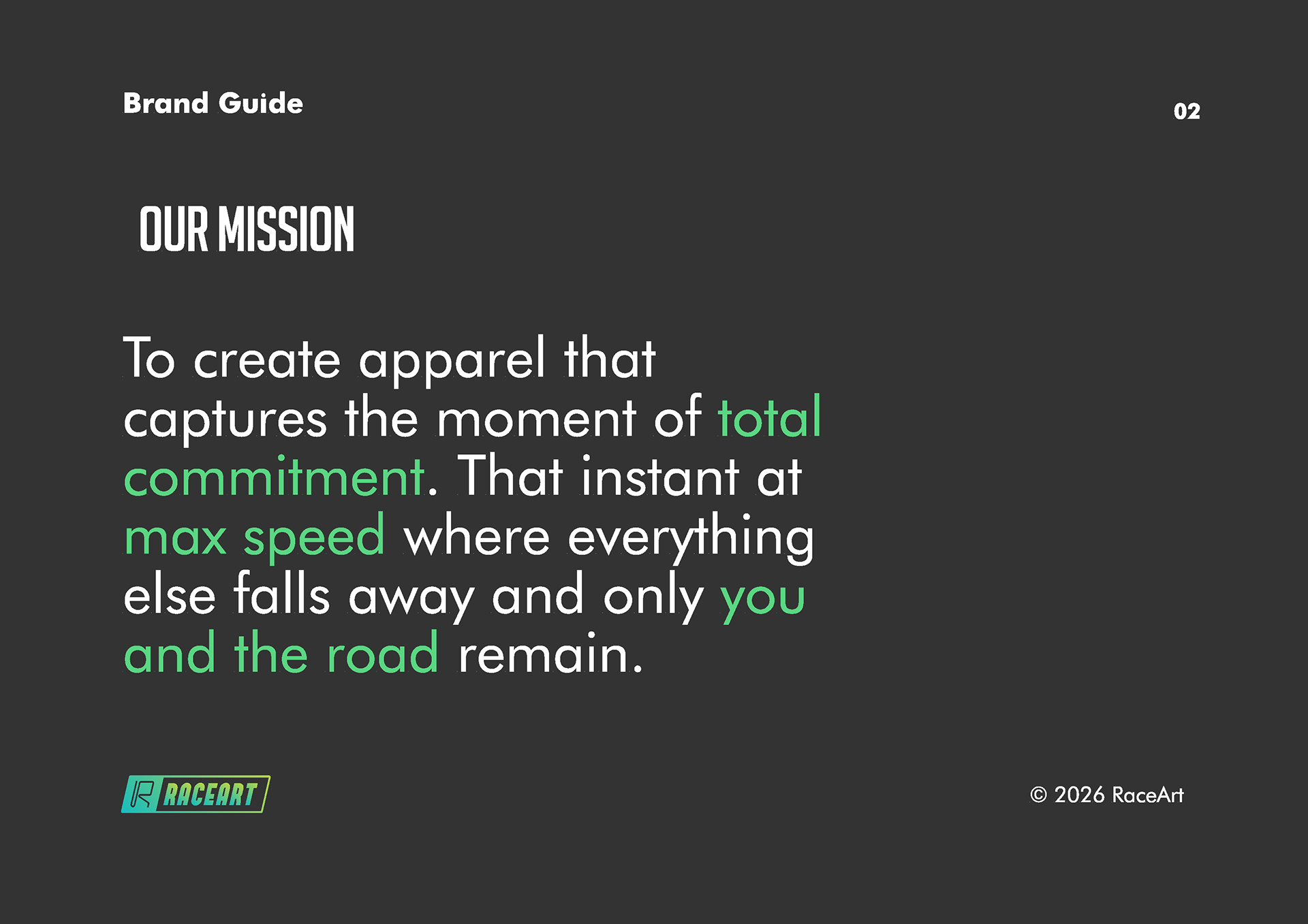
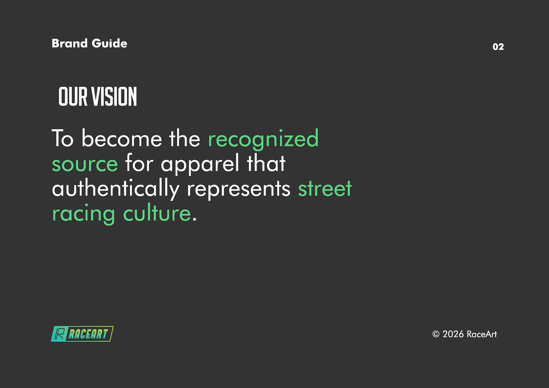
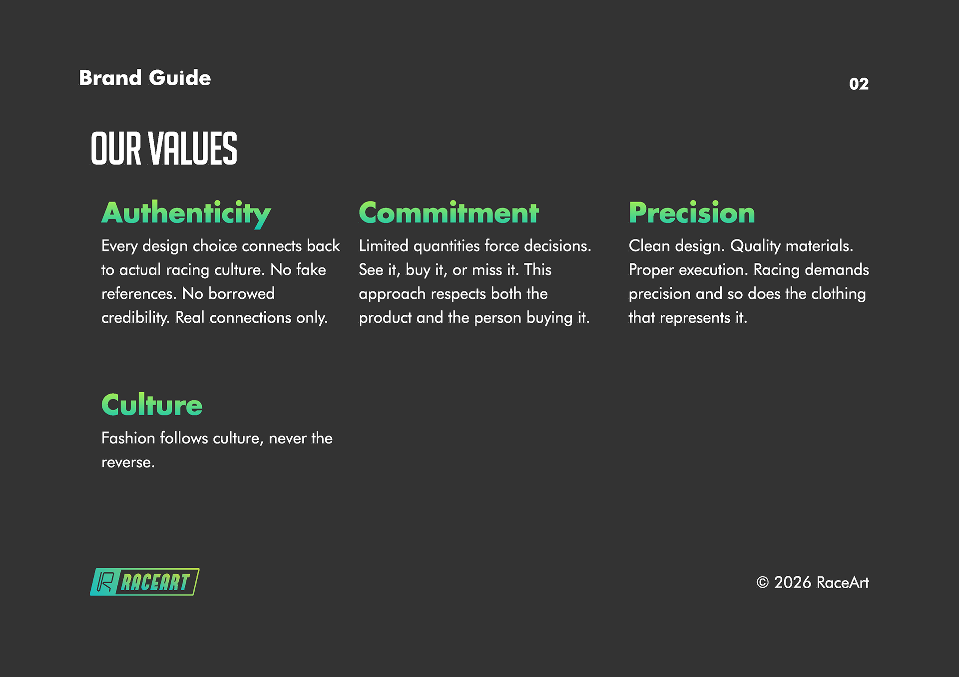
The brand book starts with core strategy: mission, vision, values, and personality. I defined RaceArt's mission as capturing the moment of total commitment at max speed, that instant where everything else falls away and only you and the road remain. The vision positions RaceArt as the recognized source for apparel that authentically represents street racing culture. Values center on precision, commitment, authenticity, and culture, reflecting what actually matters in racing rather than generic brand principles.
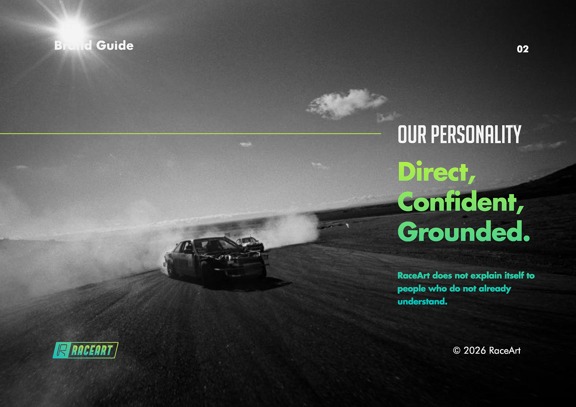
Brand personality presented a specific challenge. The voice needed to be direct, confident, and grounded without explanation. I wrote it as a statement: "RaceArt does not explain itself to people who do not already understand." This single line does more work than paragraphs of personality descriptors because it shows rather than tells.
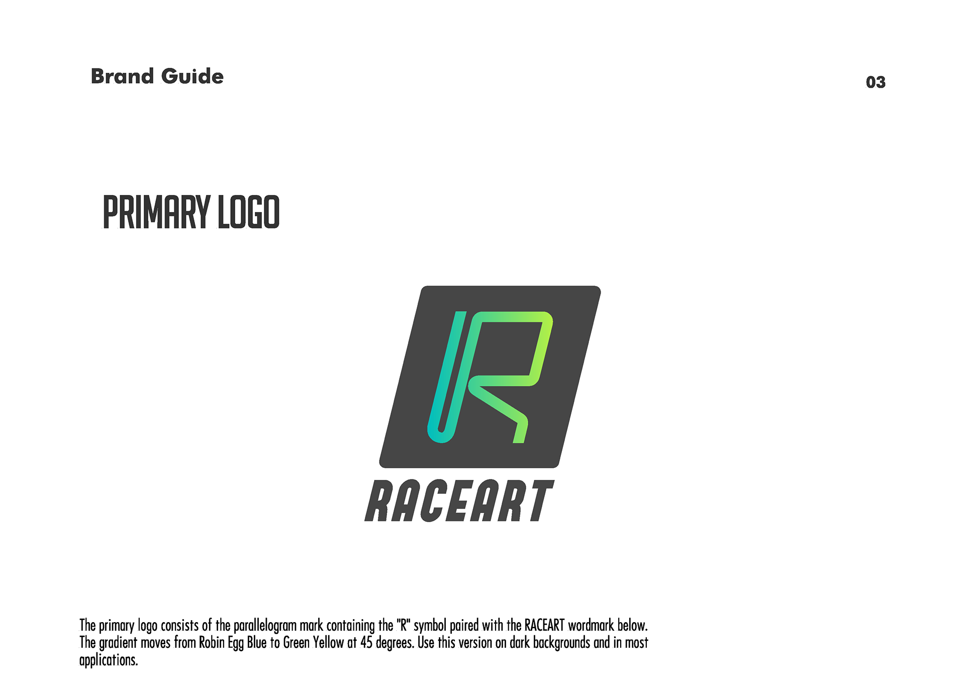
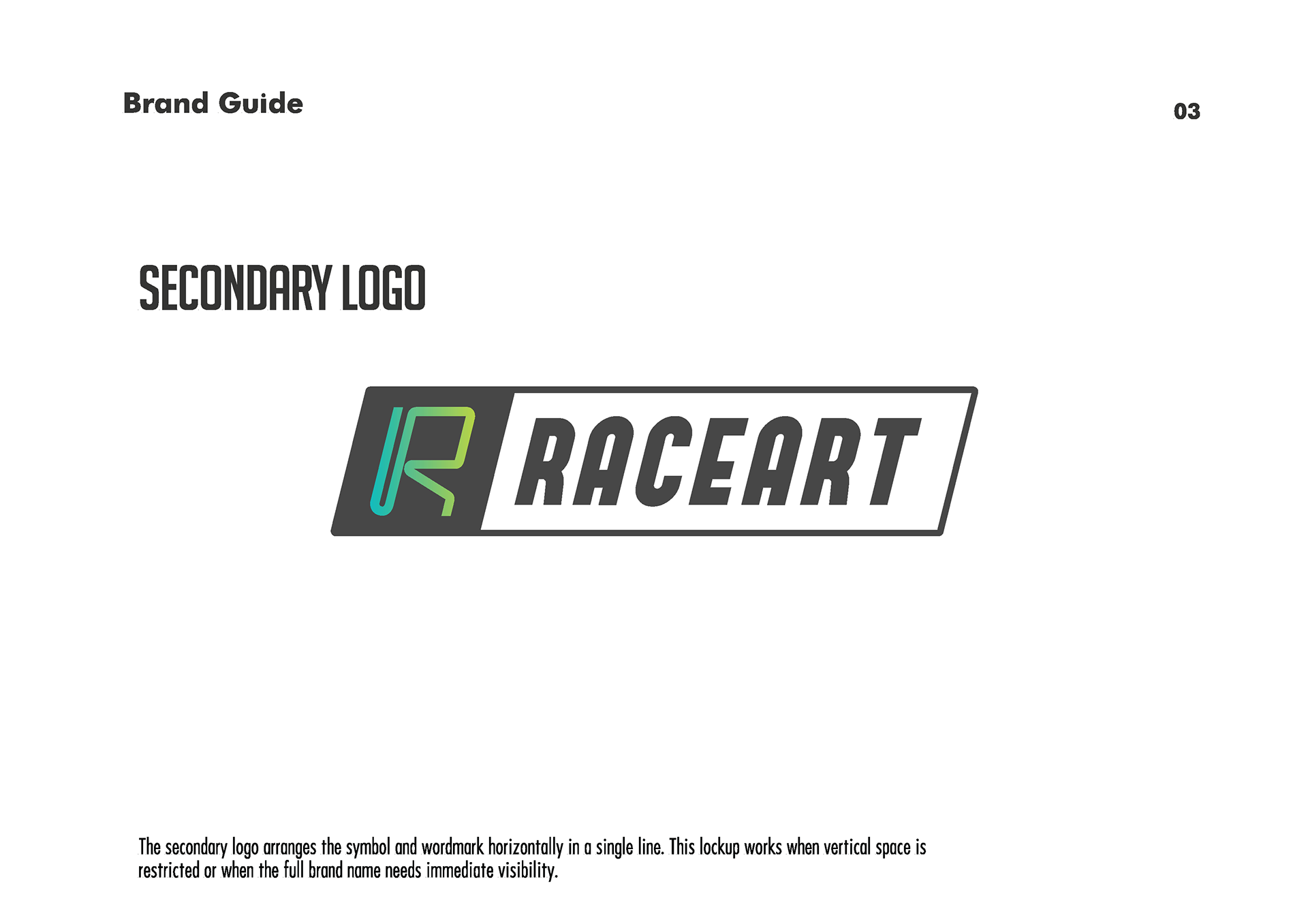
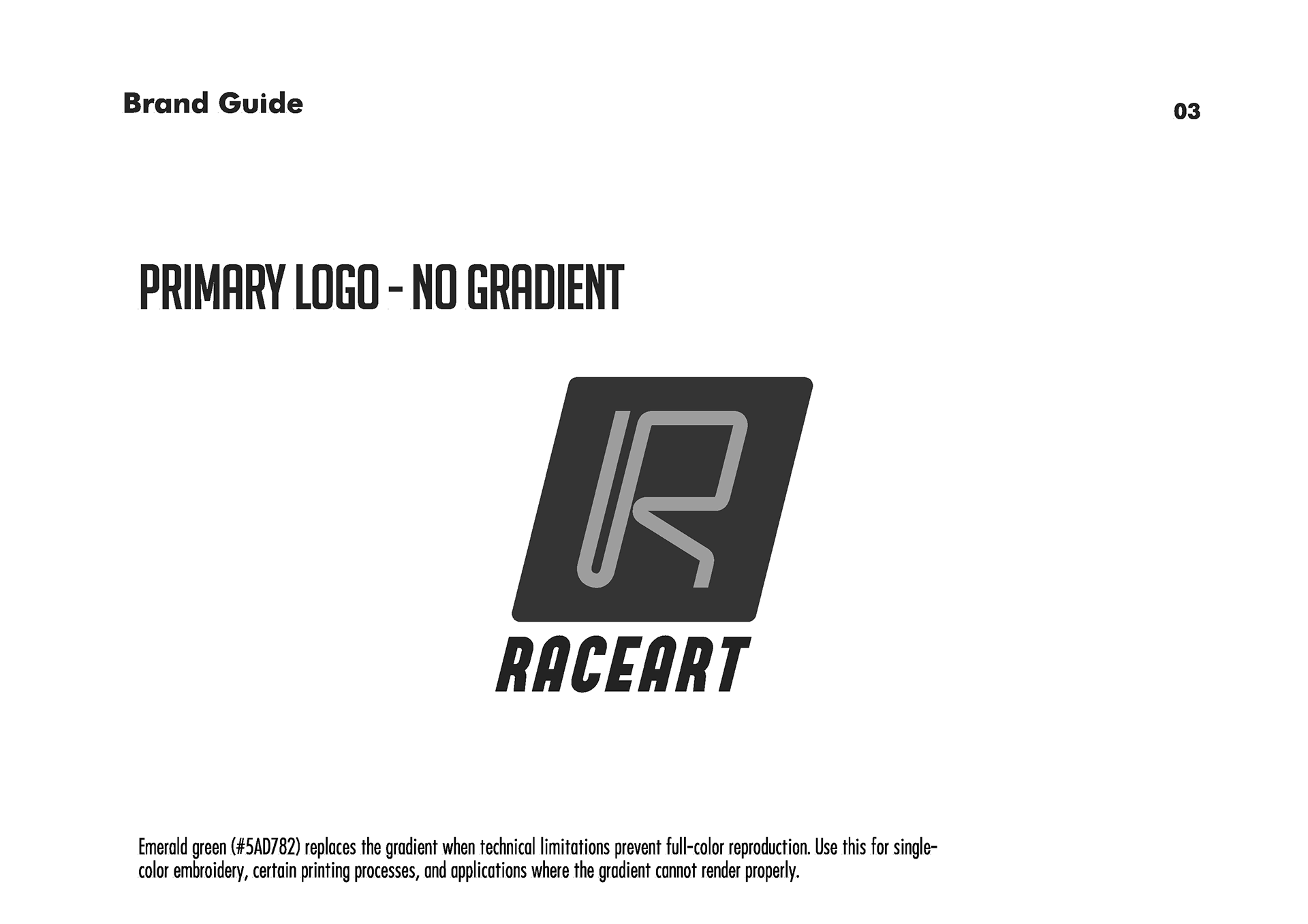
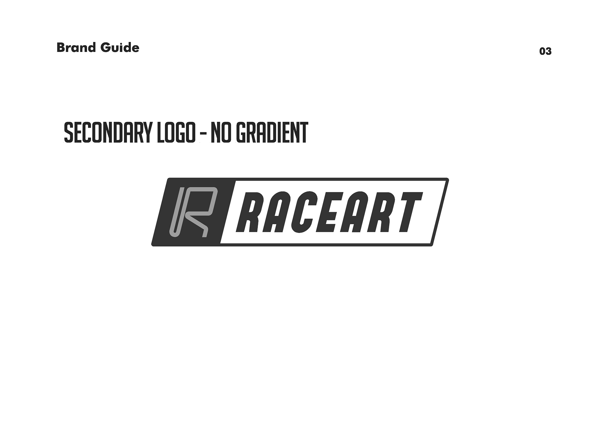
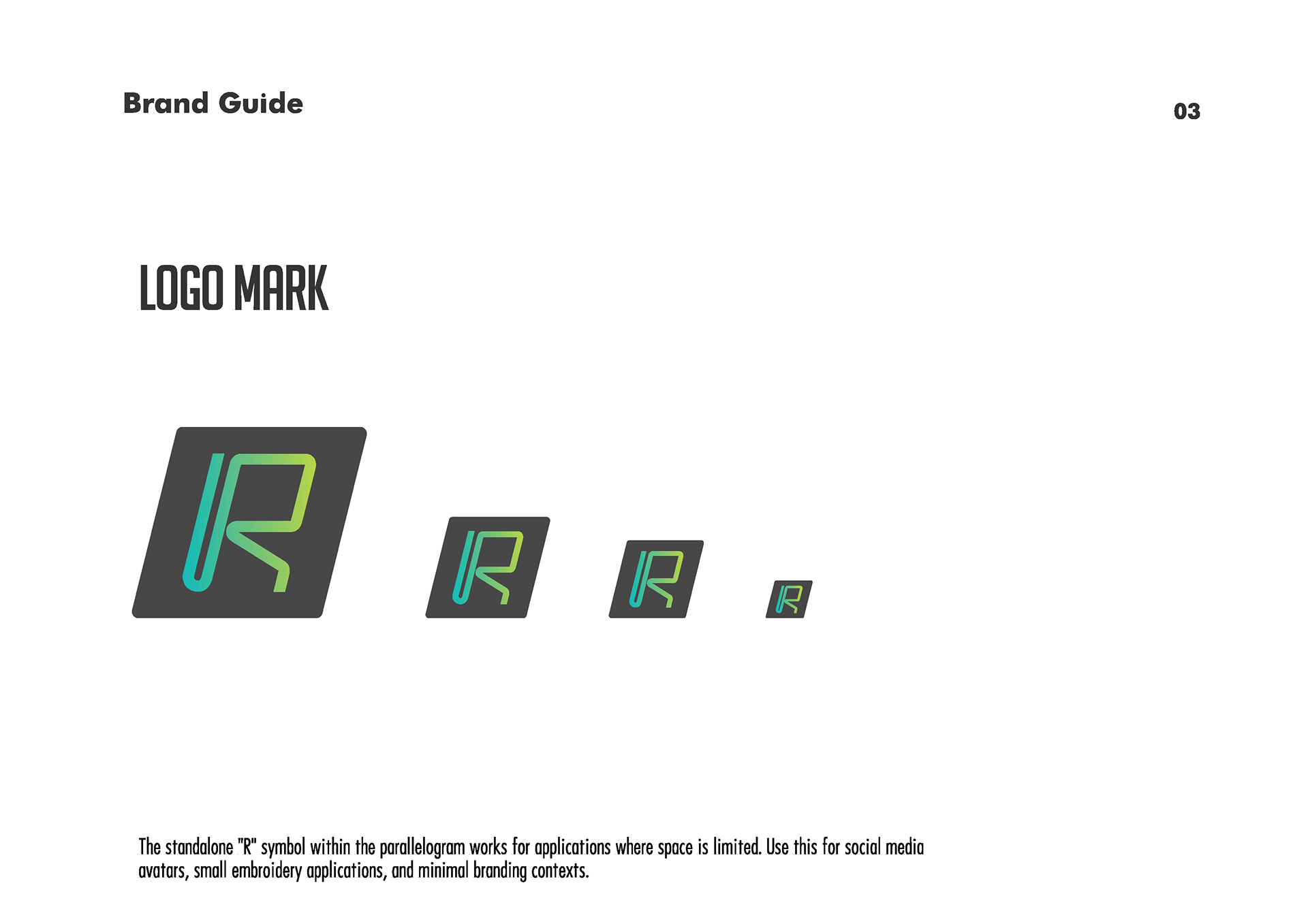
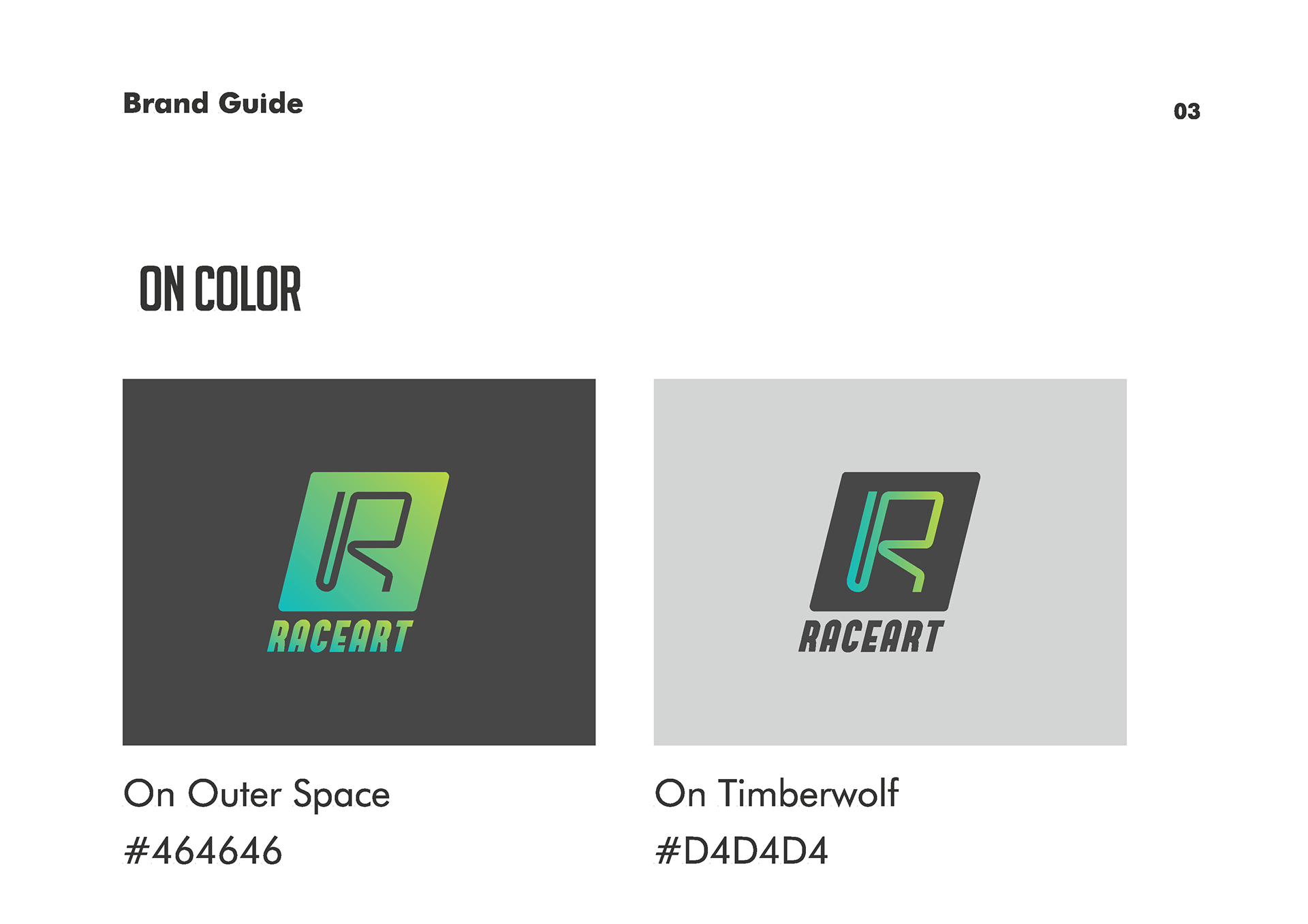
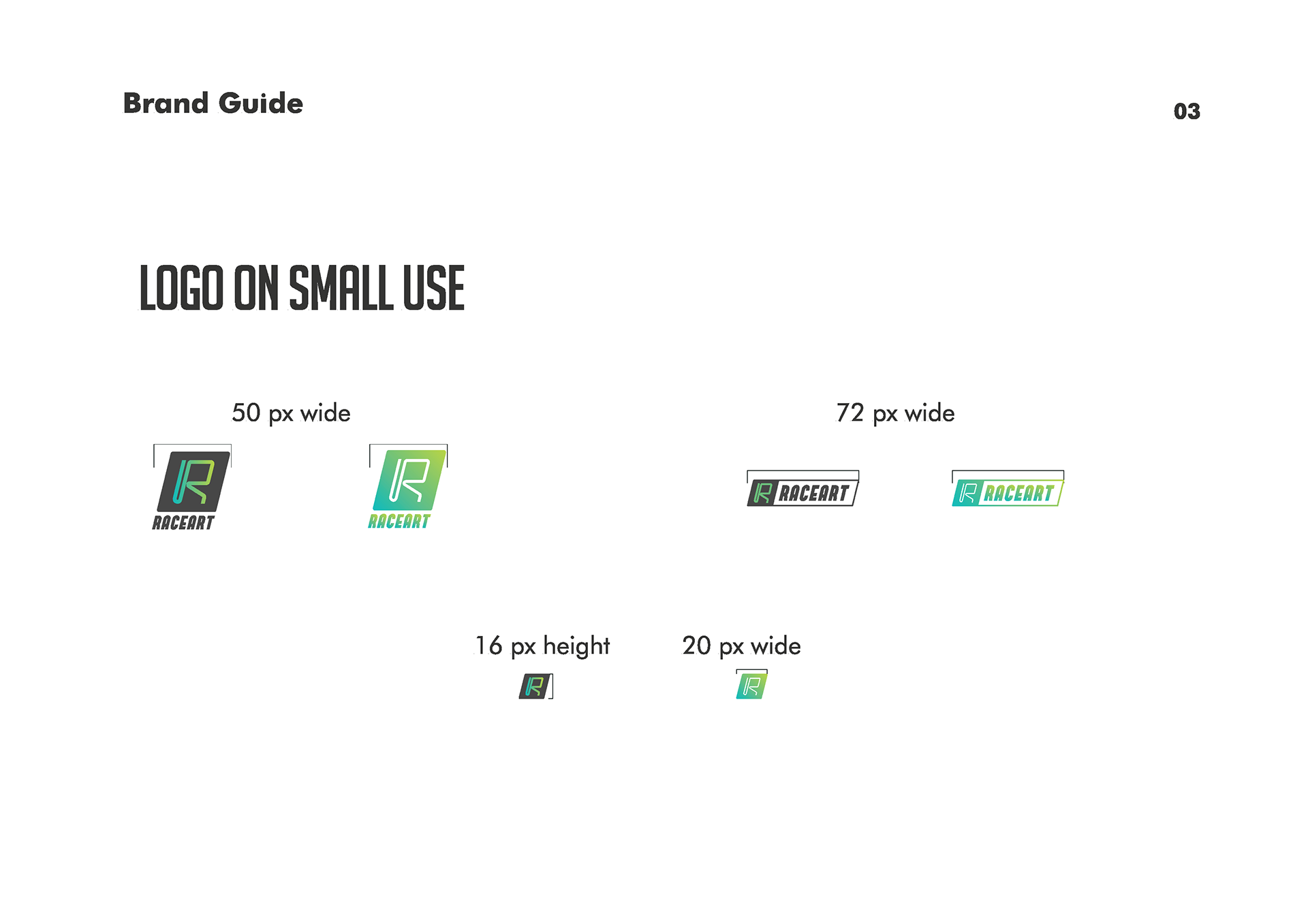
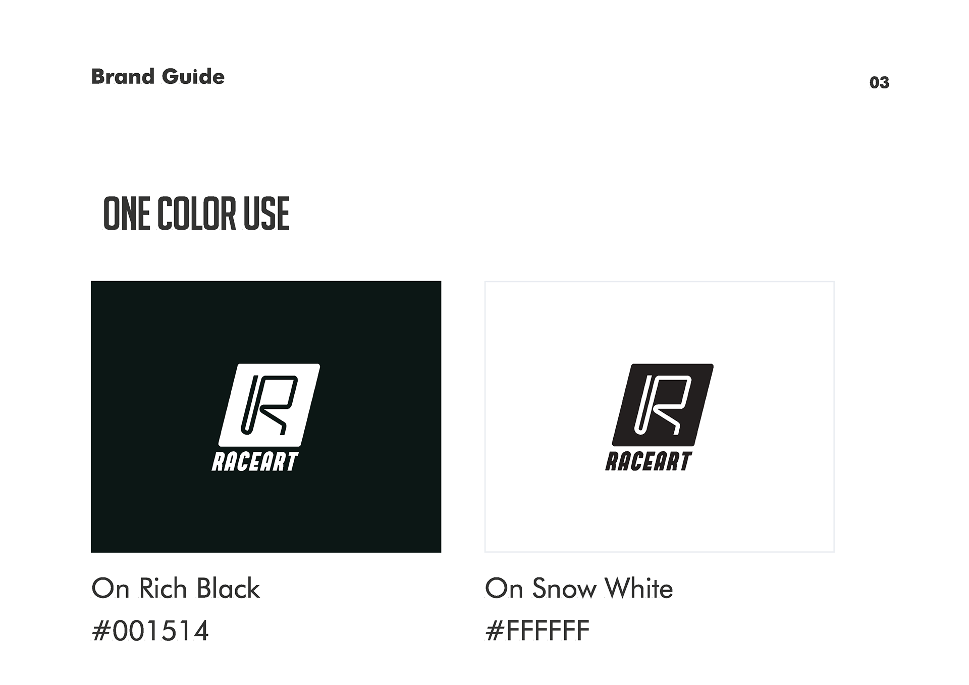
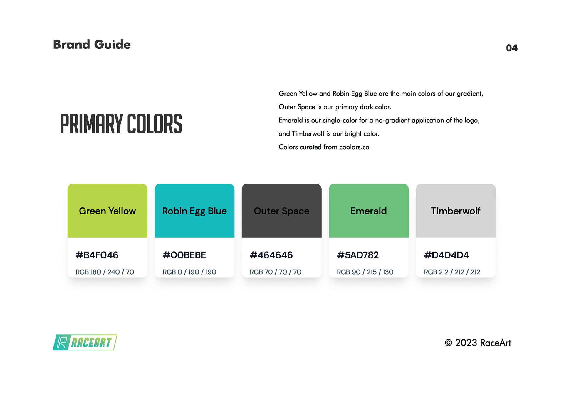
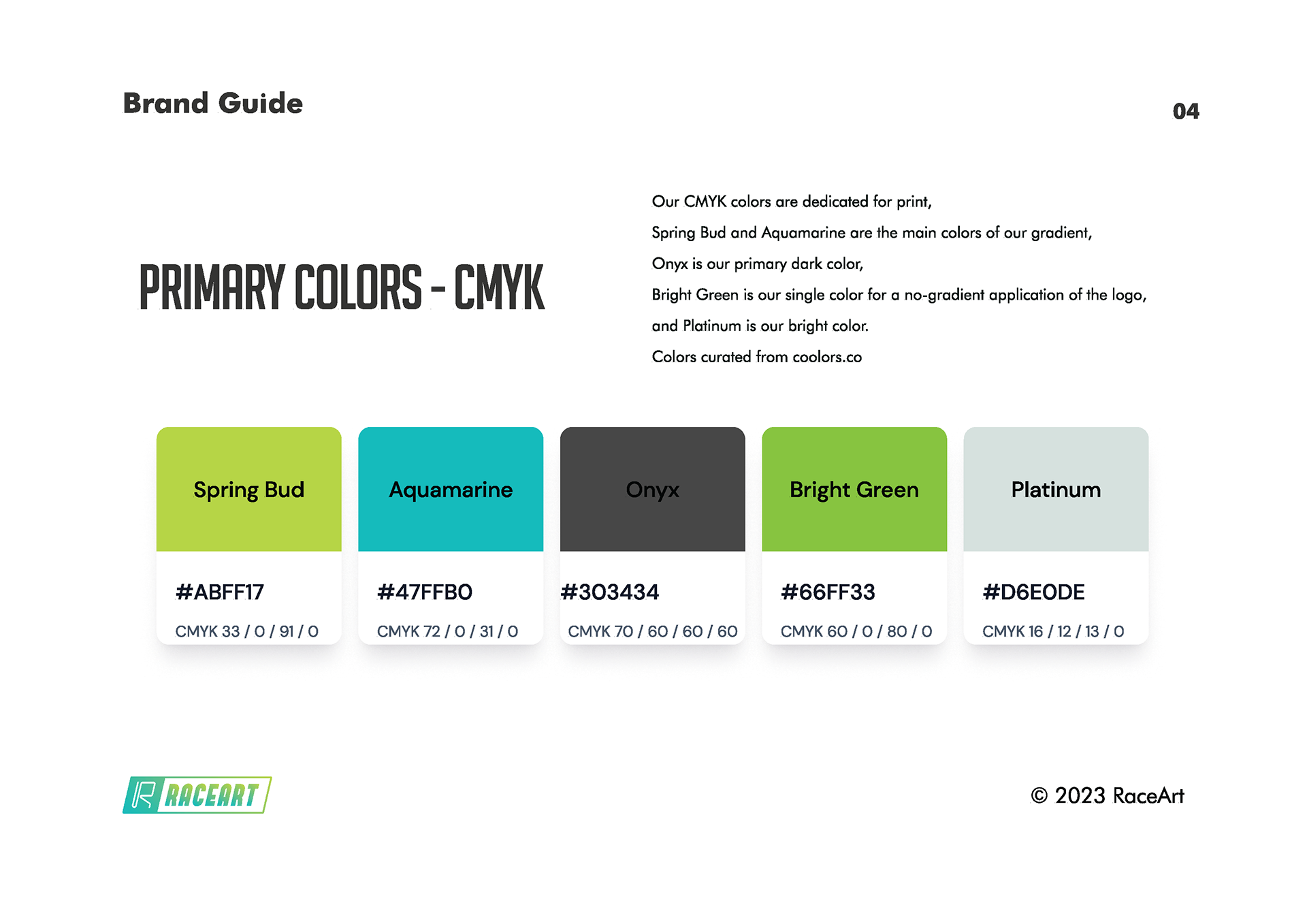
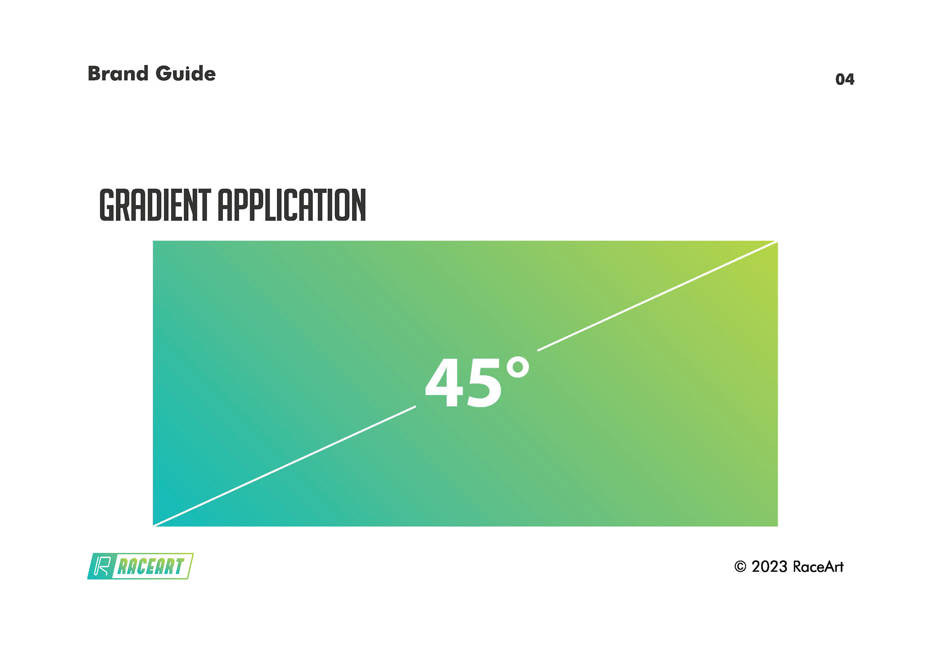
The visual identity section establishes logo usage, color systems, and typography hierarchies. I specified when to use gradient versus solid color applications, minimum size requirements, and placement guidelines across different contexts. The color palette combines Robin Egg Blue and Green Yellow for the signature gradient, with Outer Space as the primary dark and Emerald for single-color applications. Each color includes RGB and CMYK values for consistent reproduction across digital and print.
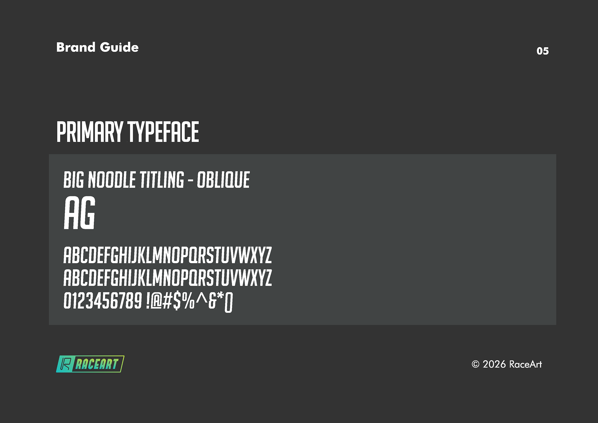
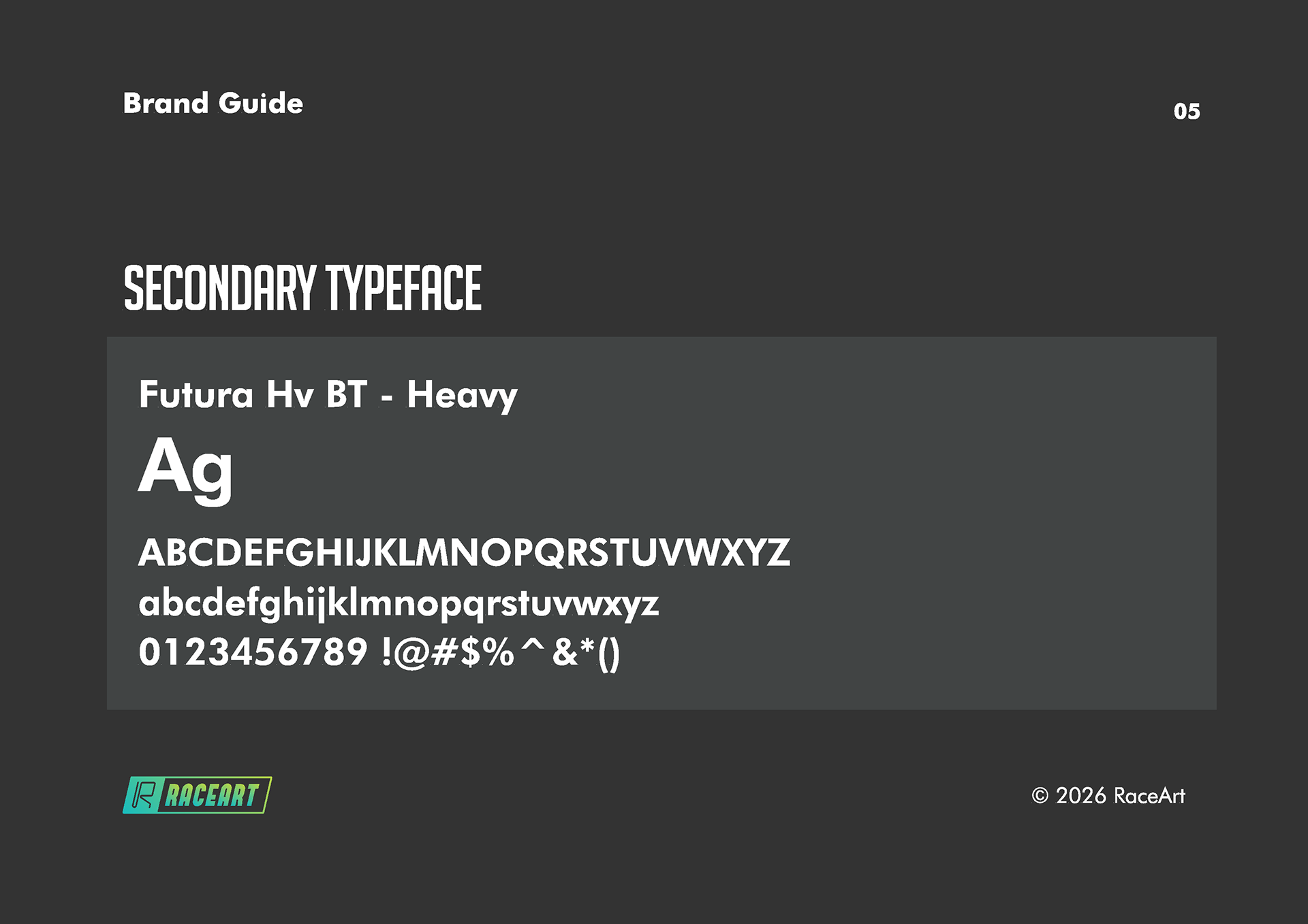
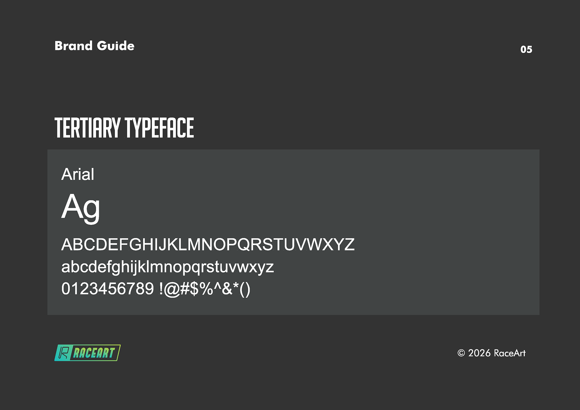
Typography uses Big Noodle Titling Oblique for headlines, Futura Heavy for subheads, and Arial for body copy. I documented the hierarchy through actual examples showing how these fonts work together in product announcements and marketing materials.
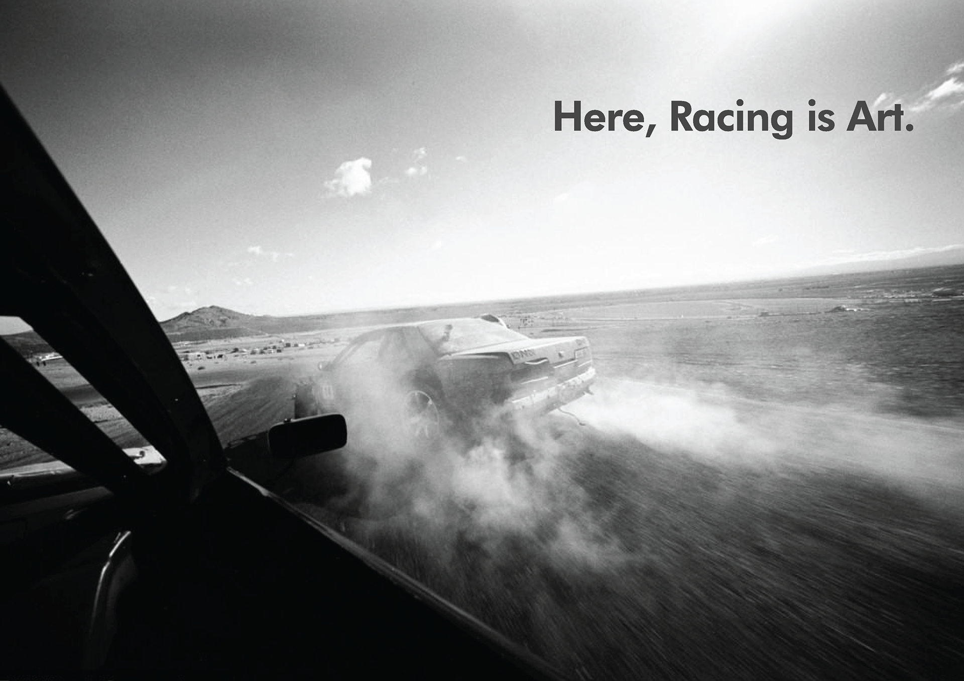
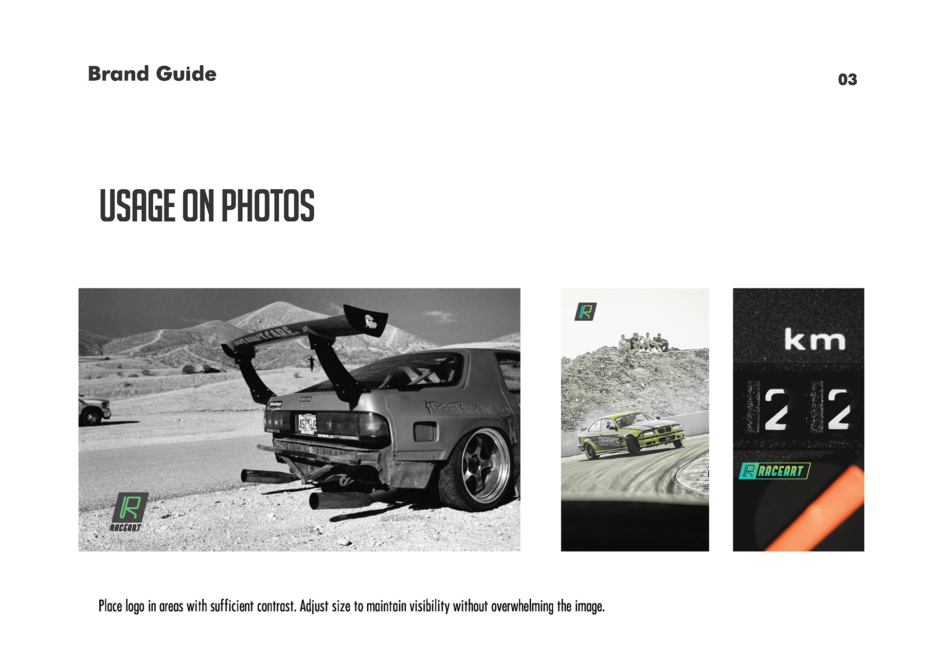
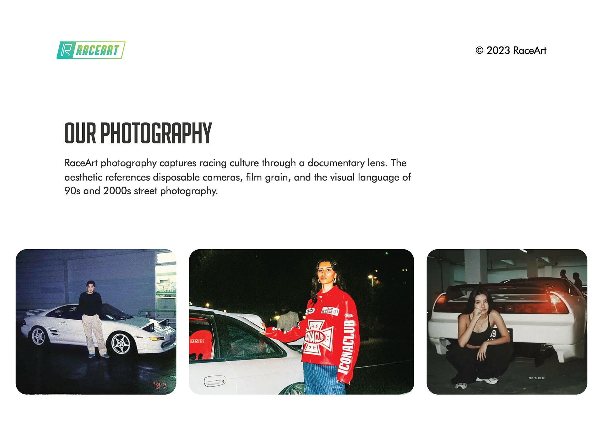
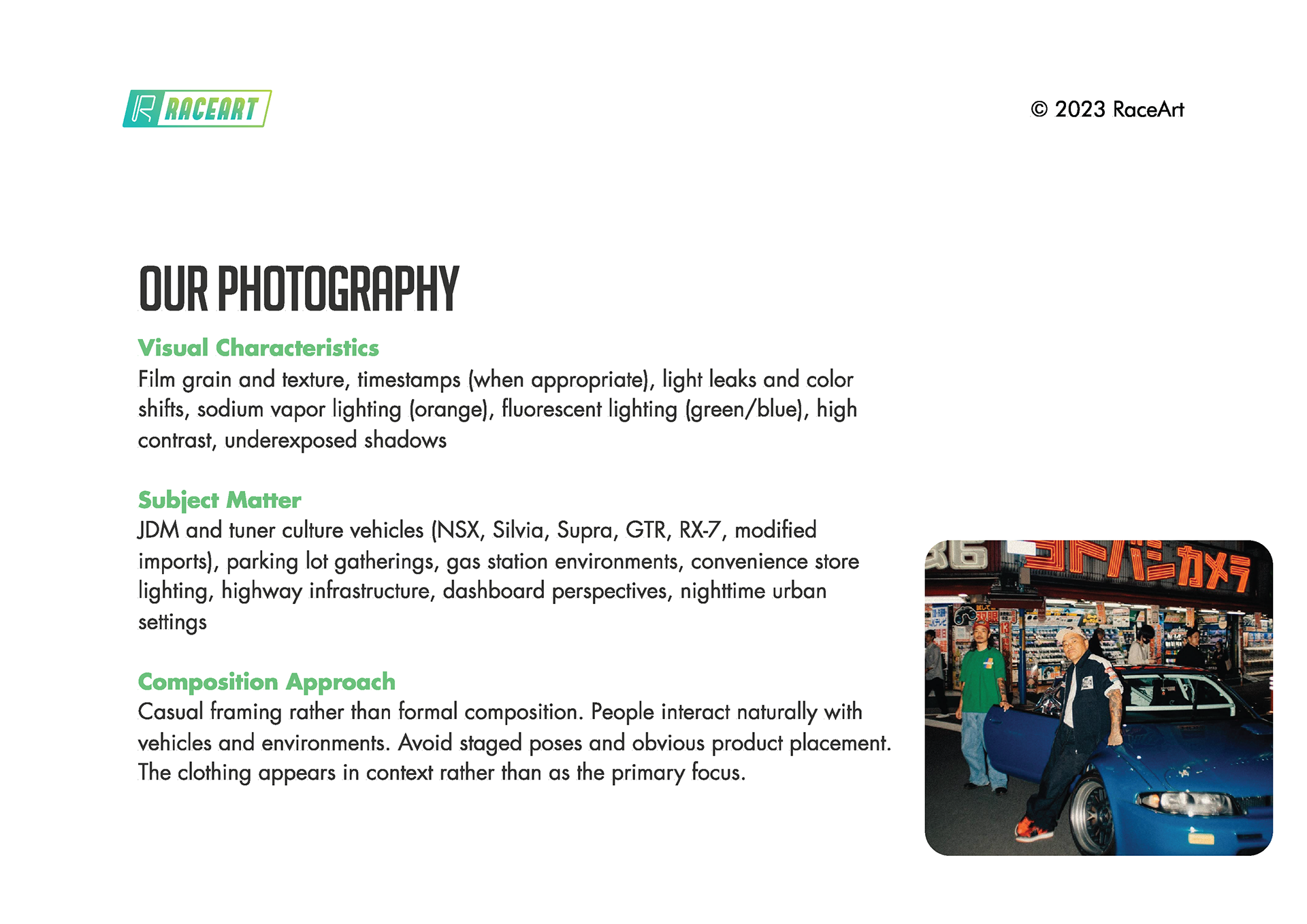
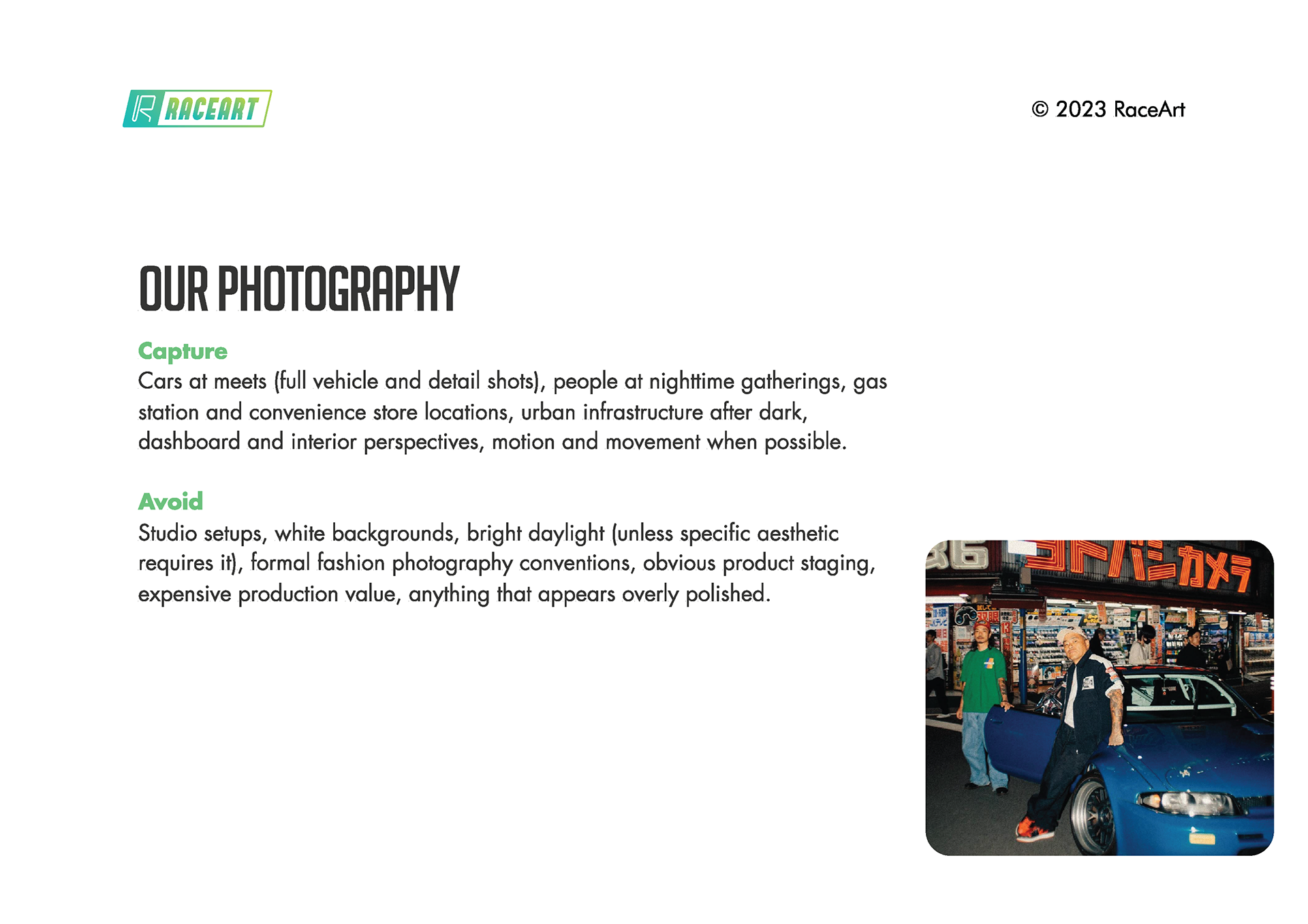
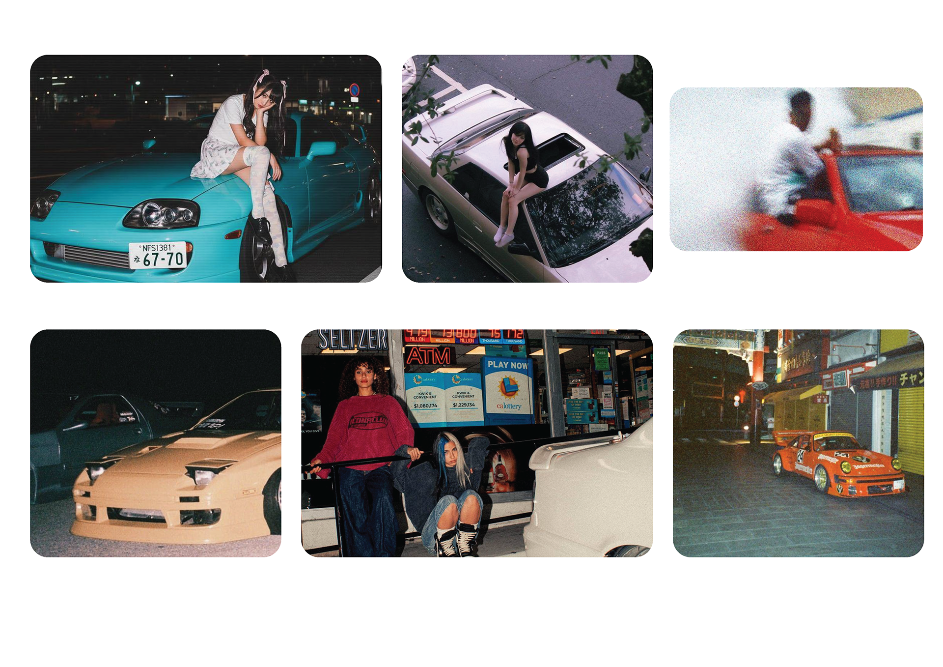
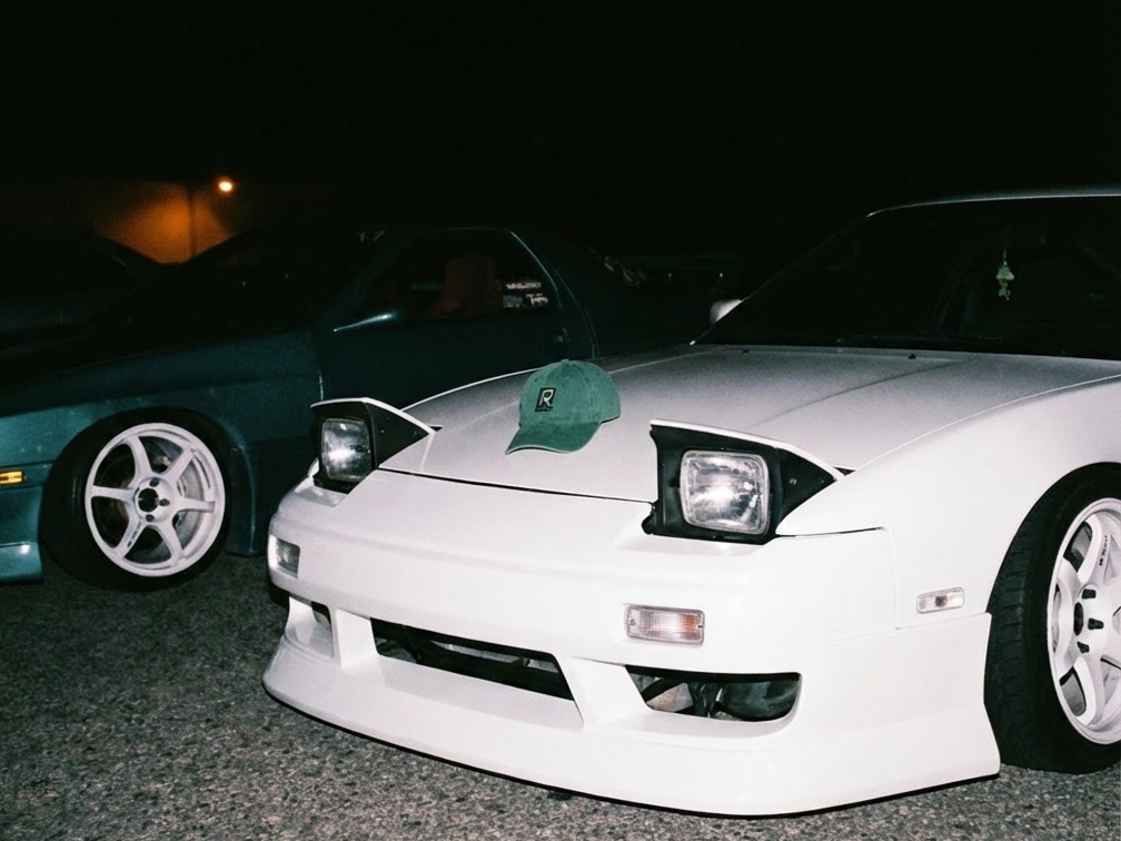
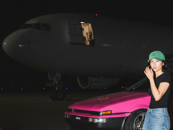
The photography section required the most strategic thinking. I documented specific visual characteristics that define authentic car culture imagery: disposable camera aesthetics, film grain, sodium vapor and fluorescent lighting, gas stations and parking lots, JDM vehicles, casual framing. The guidelines specify what to capture (cars at meets, nighttime gatherings, convenience store locations) and what to avoid (studio setups, bright daylight, formal fashion photography, obvious product staging).
I wrote composition guidelines that prioritize documentary authenticity over perfect framing. People interact naturally with vehicles and environments. The clothing appears in context rather than as the primary focus. This approach separates RaceArt from brands that use cars as props in fashion photography.
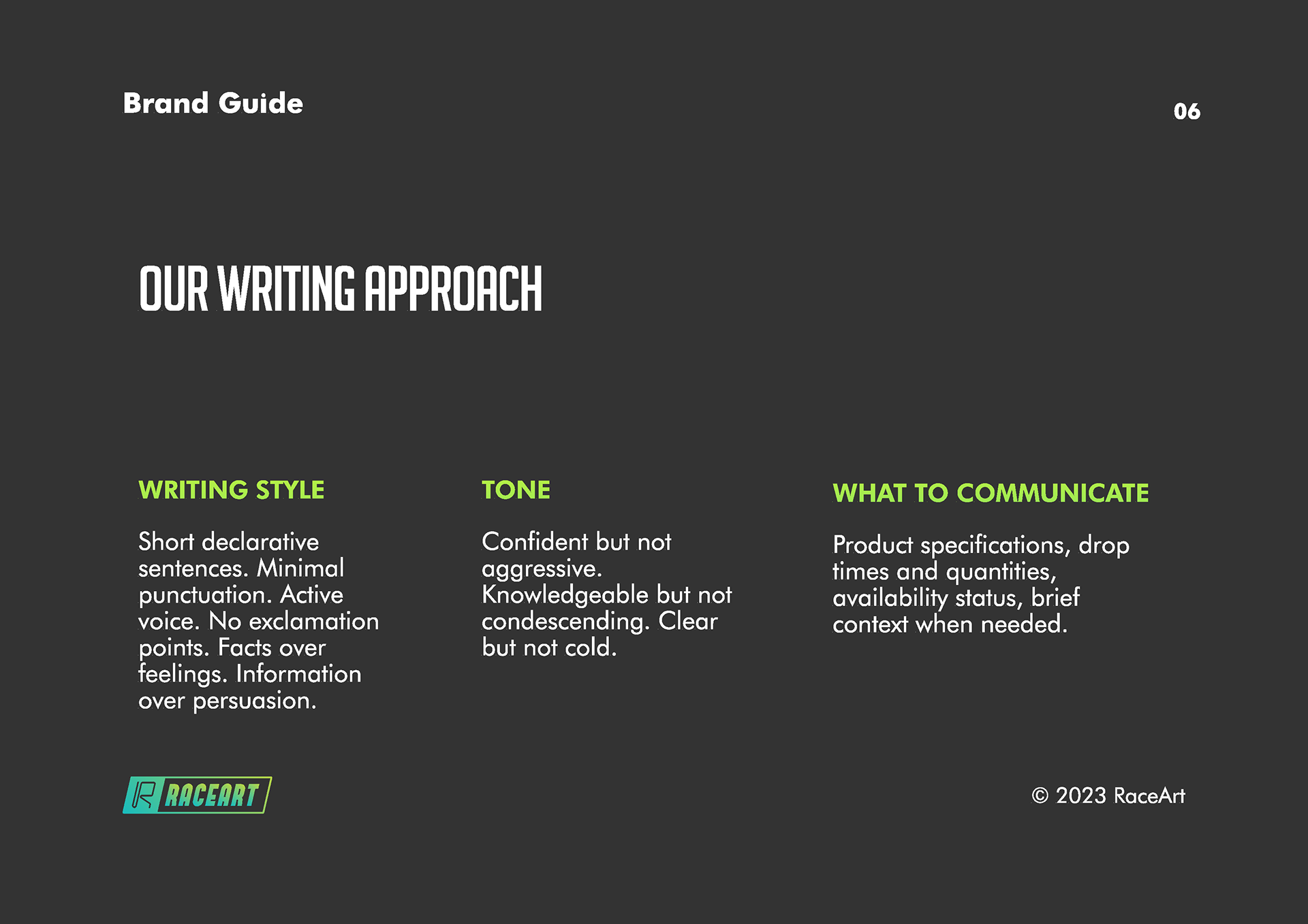
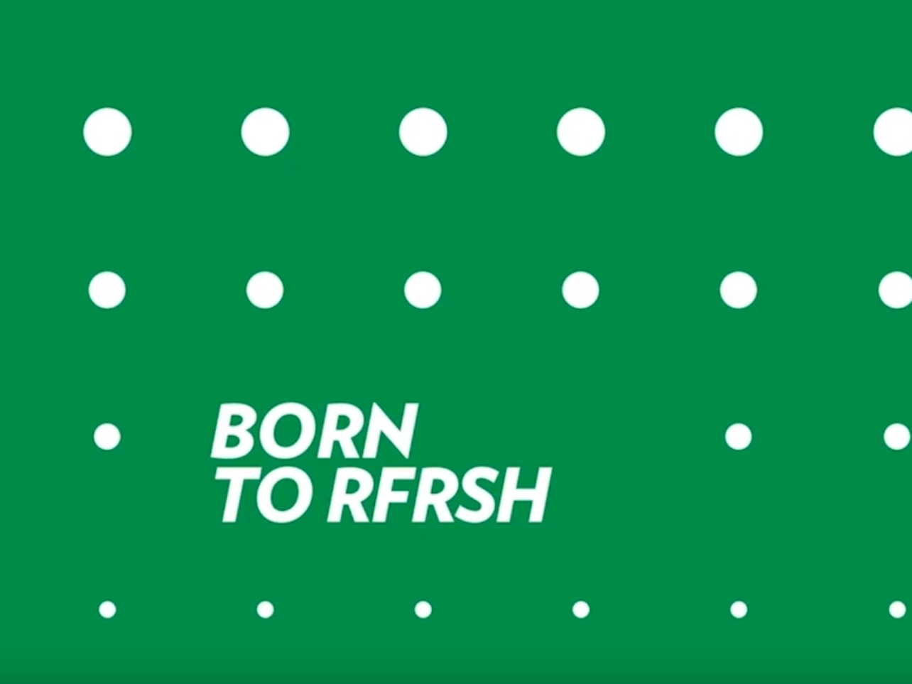
The writing approach section establishes voice and tone rules. Short declarative sentences. Minimal punctuation. Active voice. No exclamation points. Facts over feelings. Information over persuasion. I included specific examples of compliant and non-compliant copy so anyone working with the brand understands the boundaries.
The entire brand book runs counter to typical brand guidelines that try to control everything. I built constraints that maintain integrity while allowing creative flexibility. The system works because it defines what RaceArt is through what it refuses to be: polished, explanatory, desperate for approval, disconnected from actual culture.
This brand book proves I can build complete brand systems that balance strategic thinking with practical application. The work translates cultural insight into actionable guidelines that protect brand equity while enabling execution across multiple touchpoints.